Search This Blog

Friday, February 01, 2013

A few images.....

I've been busy elsewhere but I thought I'd pop back in to blogger-land and post a few of my pictures.


I'm  currently experimenting with several different styles and ways to incorporate my Zbrush stuff with inked sketches....with something horror-themed and very creepy in mind (hopefully!)

- Shane

(All images (c)copyright Shane Sheils)

Tuesday, December 18, 2012

Blender Integrated Bullet Physics Build


At the moment I'm trying out an version of Blender (graphicall.org) that has integrated the bullet physics engine into the regular settings (located alongside Clot sim/Fluid sim/Smoke sim/etc)  - instead of having to go through the old method of having to simulate rigid-body physics  by utilizing Blender's game engine, then baking that simulation to keyframes.

It works really well. 
Here are a couple of example videos from developer Sergej Reich.

You get instant feedback in the 3D viewport of the rigid-body sim as it happens: no more switching to game engine, pressing the 'P' key and having to watch a crappy flat textured version of your objects coming crashing to the ground!

I've been using Blender since I think version 2.37.
We're now at version 2.65 and there has been a major re-haul of the user interface since v2.5+.

The rate of development of Blender is impressive. I've always felt that it will eventually start finding it's way to general usage amongst the bigger VFX houses.
 I saw a comment on a website somewhere the other day from someone writing about Blender: he talked about how many visual artists nowadays simply cannot afford expensive VFX software due to the current economic climate and may possibly turn to Blender as it:
(a) is free;
(b) has a full-featured VFX tools as standard such as modeling/UV texturing/uses the ever popular Nodes based interface in it's compositor which kind of mirrors programs such as Nuke/has a 3D tracker/soft body and rigid body simulations/and so on and so on;
(c) is actively in development with new features added several times a year.
 He then went on tho speculate that these users would then grow accustomed to Blender and 'bring' it with them to other studios, which in turn would gain interest amongst others. If this happens it would be great.

I've been teaching myself how to use Nuke. It's a very powerful program but somehow when using it I am reminded of Blender. I think it could be due to the way Nuke (and Nukex specifically) loads so quickly and actually at first glance seems both overwhelming yet flimsy. It's only when you play around with bot programs that you realize how incredibly powerful they really are.

The Foundry's Nuke was an in-house tool that just got taken on by so many prefessionals who liked it's way of working. The same could happen with Blender if it gained good word of mouth.

There are many niggles with blender, but that goes for all software. After Effects, I find, has an awful interface but you see beyond that when you get it to do what you need it to do.
Blender is often criticised for being a bit of a Swiss army knife of a tool, a jack of all trades yet master of none.
But I find Blender's camera tracker to be very good and easier to use than the Camera Tracker in Nuke or After Effects. The movement in 3D space is way better in Blender than both Nuke and After Effects as well as Cinema 4D and Lightwave. Many of it's buttons are more intuitive than any of the other programs (with the exception of  Nuke).

Going back to my initial posting, the integration of rigid-body simulations into the general workflow of Blender is in my mind is a significant (admittedly very belated!) development which hopefully will have a knock on effect on other developments such as a set of presets for collisons and other simulations so theres less fiddling around through incomprehensible settings before you get the look you want!


-Shane

Monday, May 28, 2012

Matte Painting and Suggested Detail = Realism

I'm not a big fan of hyper-realistic pictures that look like photographs in general - and that's not just because I don't have the skill or talent to do such stuff! - but I do like pictures that have a certain amount of detail or rendering that makes them seem like they could exist in the real world.

This got me thinking as to what exactly the 'right' amount of detail is, something particularly relevant to matte paintings fro film which need to integrate seamlessly into real footage.
As far as detail is concerned, I don't think its a mathematical formula of a certain number of strokes, but more a sense of what suits each individual piece - and should come after mood and feel in the pecking order of importance.
Some stuff can seem incredibly solid but on closer inspection is made from a few perfectly placed brush strokes, a bit like an Impressionist painting.

This reminds me of a story I read about in a book once where a movie matte painter (the guys who paint fake backdrops such as landscapes or skies to be superimposed on live-action footage) spoke of the time a producer visited the set one day to inspect the painting of a ship that the guy was working on.
The producer said that it looked real when he walked in the door but as he got closer it just looked like what it was - a painting. The producer 'advised' the matte painter to add more details such as nuts and bolts to the ship painting. The matte painter nodded and smiled, knowing that it was unwise to argue with a Hollywood hotshot producer.
The producer left the building satisfied, but the matte painter knew well that adding details would ruin the illusion and actually make the painting look fake. So he left it untouched and the shot appeared in the movie (don't remember the name) as it was and was entirely convincing - so convincing that the producer actually took credit for his own involvement in making it so real!

 Here's a couple of examples of how much detail is 'enough' detail. The first is from one of the greatest ever matte painters Albert Whitlock http://www.imdb.com/name/nm0926087/ :
#Whitlocks traditional matte painting on glass.
#As it appeared on screen composited with live-action footage 

More Albert Whitlock work here, this time from EARTHQUAKE.
#Whitlocks' destroyed San Francisco painting
#A close-up detail of the matte painting where the simplistic - but perfect - brushstrokes and suggested details are evident 

*** You can read a brilliant back-story to the matte paintings in EARTHQUAKE at this website http://nzpetesmatteshot.blogspot.com/2010/08/earthquake-it-really-was-event.html ***


Here's another matte shot, this time by Bob Cuff http://www.imdb.com/name/nm0191235/ , from The GUNS OF NAVARONE.
#Bob Cuff's original matte painting.
#A close-up of the painting. Look at the simple shapes of the buildings and suggestion of detail
#The matte integrated with the live-action footage as it appeared on screen 

A good artist only used the lines and strokes he 100% needs to make his picture and excludes everything else. He streamlines.


NOTE: For anyone interested in matte paintings - or just general art technique ideas and tips - you should check out this cool website: MatteShot: A Tribute to the Golden Era of Matte Paintings http://nzpetesmatteshot.blogspot.com/

Friday, May 11, 2012

My Favourite Art Inspiration Websites

The internet is full of great ways to get inspired to create. 

A quick Google image search can provide some ideas but because the order in which stuff appears is decide by popularity - not quality - you can end up looking at some pretty crappy stuff. 

So I've compiled a short list (in no particular order) of my own personal faves for inspiring creativity.


#01 First of all I'll promote my own art DeviantArt webpage - using my pseudonym 'Shapula' - is located here for anyone interested in having a gander!

  
#02 Escape From Illustration Island http://escapefromillustrationisland.com is full of so much stuff that your head will probably explode and you could die. Seriously. Well, ok, maybe not die...but you could get so creatively excited that your hair might turn blue. Especially visit the Resource Library http://escapefromillustrationisland.com/resources/ link and be prepared to never leave your computer screen again....until your hair goes blue of course.


#03 ConceptArtWorld http://conceptartworld.com has concept art. Well, what else did you expect?!


#04 VisualNews http://www.visualnews.com is another site similar to EmptyKingdom.com. It features lots of inspiration and ideas to make your brain warm up and feel all snuggly. Or it can make your brain melt.

 
#05 This guy's website, AlexHays.com http://alexhays.com/loomis/ provides links to freely download pdf books by acclaimed artist Andrew Loomis http://en.wikipedia.org/wiki/Andrew_Loomis Loomis may have written these books back in the day - some of the writing style and models drawn may seem dated and quaint - but he was bloody brilliant and inspiring.... and these are probably the best practical drawing and illustration books ever written. Read these books and you'll immediately get better at art.

 
#06 GurneyJourney http://gurneyjourney.blogspot.com/ is Dinotopia creator James Gurney's great website  is full of inspiration and advice.


#07 EmptyKingdom http://www.emptykingdom.com/ is a great website showcasing all forms of visual art from film to photography, painting to sculpture. I like choosing a random page and then clicking on the image links on the side which take you to cool places on the site.

 
#08 PetaPixel http://www.petapixel.com always has cool and inspiring ideas and the latest photographic news.

 
#09 CoverBrowser http://www.coverbrowser.com/ is a site that allows you to view hundreds of thousands of book and comic covers throughout the years.

 
#10 In-Public http://www.in-public.com/ is a site for public nudity....only kidding. It's great site for street photography. The galleries are inspiring - and especially so because it's all everyday, regular stuff captured with a twist.


#11 Sweet-Station http://sweet-station.com/blog/ is a site similar to EmptyKingdom. It has lots of cool stuff.  

#12 TodaysInspiration.com TodaysInspiration http://todaysinspiration.blogspot.com/ does exactly what it says on the tin - inspiring images and sketches. It can take a while to load all the images though.

I'll continue to add more links when I can and feel free to recommend any other sites you think I should check out too.

- Shane

Monday, April 23, 2012

How to Get Rid of annoying Circular Dynamic Feedback pointer in Windows

There are few things more annoying than that stupid animated swirly circle thingy that Microsoft decided to add to any pointing interface in Windows. (shown below)


It may look lovely to some sad fool out there, but it is impossible to draw or paint using a drawing tablet while this thing pops up all the time.

It was only last year that I discovered a website that showed how to get rid of it called http://viziblr.com/

Amazingly the only way to remove it is to alter the registry.
But don't worry, because the website provides a simple tool to automatically fix it for you....plus it also provides another simple tool to restore it in case you miss that little %$*^&!

It is amazing that Microsoft never thought of how completely useless and irritating their little animated circle pointer would become and not even consider including a button to un-select it!

Anyway, here is that link again http://viziblr.com/news/2011/8/14/the-ultimate-guide-to-making-your-wacom-tablet-work-on-windo.html

You will not regret getting rid of those damn circles!

Tuesday, April 10, 2012

Problems Accessing Blogger

I've been having problems accessing my blogger dashboard account lately and this is the first time I've been able to post on my site for a while.

If it continues like this I might just quit blogger entirely and switch to wordpress or something else instead.

Friday, March 02, 2012

Rubik's Cube Camera Mapping UV projection TEST + Blender + After Effects


Another (very) brief experiment using the UV projection modifier in Blender.
The resulting 3D animation is made based on a single still photograph that was projected onto some basic cube shapes, then a separate camera was used to render a short animation.
The cubes only have 3 sides each and are simple flat planessubdivided and rendered with a normal map.

The scene was re-lit in Blender in order to create realistic 3d shadows. This was the part that really amazed me while doing it in Blender 2.62: The GLSL preview allowed me to make changes to the lighting and see exactly what it would render like in realtime!
I haven't used Blender that much since it's complete UI overhaul and the last project I used it for was in Blender 2.49 using a crappy computer. It's taken me a little while to adjust to the new UI - and initially I was sceptical of the changes are meerly cosmetic and a case of bulking out the software a bit too much - but I am won over.
Blender truly is the best software progrma out there for 3D animation and modelling. It always was fairly intuitive in terms of it's workflow but occasionally you could very easily get lost in it's little buttons and menus. Versions 2.5+ have worked hard on fixing that.

Ok, lets get back to the little test footage above.
The cubes lighting up was added in After Effects using a keyframed 'Paint Fill' plugin. set to 'add'.
The 'music' (cough!) was thrown together and added also in After Effects.

Problems? Well, it's basically just a few cubes with textures projected onto them and there was no attempt made to make a more complex Rubik's Cube shape that would have added more realism. But camera projection mapping is all about saving time and getting a animated shot from a still photograph so, from that point of perspective, it does what's expected of it.

I'm looking forward to doing more experiments in camera mapping to see what effects I could use in my planned sci-fi feature.

Stuff used: Blender 3d, Adobe After Effects, Reaper, Nikon Coolpix camera for taking picture (obviously!)

Wednesday, February 29, 2012

2D to 3D Camera Mapping Blender 3D + Adobe After Effects TEST


Another version of the camera/projection-mapped shot of a gas station I did earlier this week.
This time I have more parallax in the shot to show depth. You need to take into account that this is just a single still photograph that has been converted into something that allows camera moves (although limited, I admit).
Rendered/modelled (using basic cubes and planes) in Blender, then composited in After Effects (dirt, grime, lens flare, colour correction, various blurring and extra camera shake to simulate a 'real' camera move).

There are still lots of problems with this shot in terms of getting away with it being inserted into a live action film and not sticking out like a sore thumb:

- The primitive shapes (boxes and planes) I used to construct the 3D scene could be added to in order to create more depth - particularly on the gas station shop which could do with extrusions around the windows and doors in order to add a more 3-dimensional feel.

- The reflection of the gas station on the ground is a bit sad looking. I didn't spend any time on it and the reflection in the previous example is far better (becasue I spent a bit more time on it).

- The Ice Box could be modelled in basic 3D instead of being part of the gas station shop facade.

- I should have rendered a separate depth pass which I would then composite to add true depth of field in After Effects. Instead I just masked out sections of the background in After Effects and faked a depth of field using the camera lens blur effect.

- More atmospheric haze and debris would add depth to the shot and help reduce the feeling the gas station is just a model rather than a real, full-sized construction.

- I drastically reduced the speed of the shot in After Effects to add more 'weight'. I also added little bumpy wobbles to the camera move to simulate a real-world camera person. But I can't help feeling the the shot could do with being slowed down even more.

But this is just an experiement and now I know that camera mapping works and is relatively simple to achieve one the initial set-up is done. Going into The Gimp (or Photoshop) and breaking a still photograph into individual layers based on how they occlude what is behind them, then using the clone tool to fill in the gaps left behind when theose foreground/middleground, etc elements are removed is time consuming (and boring).
Also, setting up the 3D camera in Blender (or any 3D package) and trying to match the angles is a pain in the *%$!

But once that hard stuff is down you star seeing how cool an efect UV camera projection is!

Monday, February 27, 2012

Blender UV Projection Modifier+Adobe After Effects+Camera Mapping TEST


A very quick and basic test of camera mapping using Blender 3D and After Effects.

I used a still photograph and used the UV projection modifier in Blender to 'map' the image onto some very basic geometry. The camera move is very slight - and the 'shot' lasts just 2 seconds! -but you can see that it works.

I then took the render in After Effects and added film grain, colour correction, and motion tracked smoke elements and lens flare. I also added a reflection on the ground in After Effects to simulate wet ground around the gas station.

Thursday, February 23, 2012

Flys in Field at Sunset Adobe After Effects Animated Still TEST


A still image animated in Adobe After Effects (AE).

I added camera movement (an AE camera with a controlled 'wiggle' expression), animated lens flare (using in-built lens flare plug-in in AE), camera grime (a still image of some dirt which was composited on top of the footage using 'screen' mode in AE), heat haze effects (in-built Particle World plugin in AE), and animated midges flying over the long grass (using Trapcode's Particular plugin).

The great thing about this technique is that it is so simple!
Say for instance you need a shot for your movie but you don't have the time to go out and shoot it becasue the location is too far away or it doesn't exist anymore, well you could just use a still image (or photoshop a series of still images you found on the internet together) and animate it.
You have complete creative freedom to add or remove elements as you see fit.
Combine this with 3D projection/Camera Mapping and you can get more depth into your shot.
And you can of course add greenscreen-ed actors or live action objects into your shot to make it seem more real and full of life and realistic.

Tools used: Adobe After Effects, Trapcode Particular.
Music: Winter Sonata OST (When the Love Falls) - Yiruma.

Tuesday, February 21, 2012

Motion Track Fire Composite TEST in After Effects + Mocha AE


A simple test of compositing fire (from Action Essentials 2 by VideoCoPilot.net) into a handheld shot using Adobe After Effects.

The shot was tracked using Mocha - I could have used the Foundry Camera Tracker but I didn't feel it was necessary, and besides - I love Mocha!

I created some heat haze distortion and reactive lighting on the ground to blend the composited fire elements into the scene a bit better...mainly because the live action footage was very washed out as I just grabbed a quick shot without adjusting exposure or bothering to put a ND filter on!


Software used:
After Effects, Mocha AE, Action Essentials 2
Camera: Canon T2i.

Thursday, January 19, 2012

After Effects The Foundry Camera Tracker Motion Tracking VideoCoPilot Footage into Scene Test


A quick before and after comparsion of inserting some stock footage (in this case flames from the Action Essentials 2 DVD from VideoCoPilot.net) into a shot recorded on a Canon T2i using The Foundry's 3D Camera Tracker in Adobe After Effects.

This is not the most ground-beaking or exciting video test I've ever made but I wanted to focus on making visual effects blend into a scene without intrusion. I wanted the FX to be subtle.
This is the type of shot most people wouldn't even notice and consdier that someone added effects to....its not a burning building or an attack by a giant monster! But it's stuff like this - the little tweaks and changes to a scene - that make me feel that anything is possible. A basic crappy shot taken in a kitchen can be altered to suit wathever needs i see fit. This time it's just a couple of flames dancing about on a hob...but the next time it could be literally anything!

HOW IT WAS DONE:
I tracked the scene using the Camera Tracker and then created a Null from on of the created 3D trackers.
I then created a plane, made it a 3D object and parented it to the Null. I adjusted the plane to be positioned correctly in the scen in 3D space.
I added a light which I set up to effect the lighting of the plane. I added a wiggle expression to make a flickering light effect on the plane.
Next I added some fire elements from the Action Essentials 2 DVD, made them 3D objects and parented them to the same Null in 3D space. I set the fire elements to always face the camera.
After this I added adjustements with curves and various blending modes to make the fire seem like a typical gas hob.

The flames cause a flickering light effect on the scene.....which may not be particularly obvious from the clip but it is a subtle effect that makes the stock element 'sit' in the scene better.

Stuff used: Adobe After Effects CS5, Action Essentials 2, Canon T2i, The Foundry Camera Tracker.

Friday, January 13, 2012

Test of Video CoPilot Action Essentials City Explosion


A brief test using the footage and tutorial from the VideoCoPilot Action Essentials 2 DVD which I got the other day.
Some great stock footage included but it takes a combination of multiple elements and various blending modes to make it fit correctly into a live action scene and seem convincingly real.

Monday, December 12, 2011

Visual FX: the tools to make quality effects are available to all nowadays

That's one hell of a long heading!
But it gets across the point: high tech visual effects are easily doable nowadays on home computers.

Think back just twenty years and picture how far we've come since then in terms of the technological tools at our disposal such as compsoiting software, chroma-keying and motion tracking. It truly is remarkable.

I've been playing around with Mocha (the free 2D motion tracker that comes with Adobe After Effects CS4+) and I sometimes just shake my head at how cool it is.
I can shoot some handheld wobly-cam footage, pop it into Mocha, let it calculate (extremely quickly BTW) the coordinates, import the saved data to After Effects and within a minute or so insert a almost perfectly tracked image or piece of text into my shot.
It is simply mind-blowing.


But the thing that amazes me the most is not how cool the newest software is...it's why more independent productions don't use it!

Fantastical locations, earth-shattering explosions, and all other forms of visual FX trickery that Hollywood lockbusters rely on are right on our doorstep but I've struggled to think of many productions that make use of them....besides Garth Edwards' Monsters...which wasn't exactly a low budget production despite the press spin (this was not a $15,000 movie - far from $500,000 even - but many of the efects such as motion-tracked location and object insertion ARE DOABLE on a tiny budget of far less than $15,000).


It takes less than half an hour to insert a fairly realistic shot of an explosion into a film if you give it a go yet it seems many simply don't...give it a go, that is. Spend a few days polishing and refining it and you can have a great-looking effect that defies your budgetry constraints.

A few years back when I was making The Darkside I needed some cutaways to some graffiti on walls. Problem was I had no graffiti and no walls! This was some basic, no frills FX work that had no bells and whistles or needed to stand out in any way, but it was necessary to the film and was achieved with the most basic of software: Microsoft Paint!
I stitched together some wall images in MS Paint (using a broken mouse - I had no graphics tablet at the time even) and painted in graffiti on top. I then composited the images togther in a basic editing package (Magic Movie Edit - the original one) and added some movement so tha it didn't stick out as being simply a still image in amongst the rest of the movie.
This is a very simple example but it goes to show how visual FX is mostly used: to further a story. Sure, when most people think Visual FX they think of the big stuff like explosions and the likes but it is the bread and butter little things like object removal/insertion and matte paintings that seamlessly integrate with live-shot footage that it is mostly used for.

I'm not saying every movie needs visual effects but if the tools are there and you want to really add some production value to your film then why not go for it?


The inspriational lessons in using Adobe After Effects provided by Andrew Kramer over on VideoCoPilot.net are the sort of things taht make you wanna just get out there and make some amazing films and let your imagination run wild.
It really isn't that hard to blow buildings up (visual FX wise, I mean!) or show a sweeping helicopter camera move over an alien landscape these days - you just load up After Effects and Terregen and off you go. Maybe stick in a bit of Blender for adding 3D model buildings or crafts to your shot and you're rearing to go!

I highly recommend the free VideoCoPilot.net tutorials (there's 120+ so far) to inspire and get your creative juices flowing.

Dont just get stuck in the rut that is the typical indie movie of a few actors talking in one or two dull locations.
Expand your vision! Because nowadays your vision is not limited by the tools at your disposal or budget or even time, as with the advances in home computer processors rendering is really quick.

Sunday, October 23, 2011

Creating the ‘Cinematic Look’ Process


Making something look cinematic requires more than simply shooting footage with a film camera, but it actually doesn’t require a huge amount of effort or money.

In fact, the cinematic look can be recreated relatively easily once you are aware of what something ‘cinematic’ actually is (See my previous posting “Inspirational Cinematic Photography” for more)!

The key elements to a ‘cinematic’ image are as follows:

  1. Shoot 24p using the 180° Shutter Rule
  2. Shot Framing
  3. Lighting
  4. Depth of Field
  5. Grading

Let’s look at each one a little closer.

1: Shoot 24p using 180° Shutter Rule: What the hell does this mean? Well, you should shoot at the speed that cinema films are shot at, which is 24 frames per second (actually 23.976 frames per second). ‘24p’ means 24 frames per second progressively. You should use this frame rate as opposed to ‘24i’, which means 24 frames per second interlaced. Interlacing means that the picture contains two fields, which doesn’t look nice and is synonymous with the ‘DV look’ (not nice). The simple point is that you should aim to shoot at 24p because that is what looks most cinematic.

The 180° Shutter rule is an even more complicated thing to explain and you can find lots useful resources on the web explaining it with diagrams and stuff. They describe how you should use a shutter speed of twice your frames per second.

For mere mortals like you and me (you are mortal, aren’t you?) this really means that when shooting footage at 24p you should set your shutter speed to 1/48 of a second – or as close as, which is normally 1/50 of a second on DSLR’s.

When shooting slow motion footage at 60 frames per second (FPS) on your DSLR you should use a shutter speed of 1/120th of a second.

If you have a camera that shoots at, say, 100 fps then you would shoot at 1/200th of a second. Just double your FPS speed to get your shutter speed.

So, shoot at 24fps and use a shutter speed of 1/48 of a second (or 1/50th is that is the closest setting you can get on your camera). It’s best to stick to this rule and not think too much about it. It works and that’s what matters.

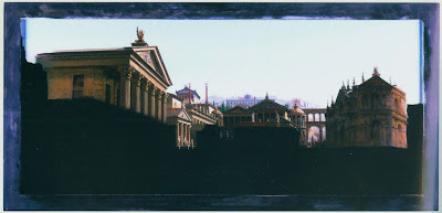
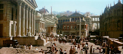
2: Shot Framing: The single most important aspect of a cinematic image is how the shot is framed. If you want to make something that looks more like something you’d watch in a cinema you need to make sure that what appears in your frame doesn’t look like your granny’s holiday snaps from last year.

Try not to put your main point of interest in the centre of the frame. Use the rule of thirds and try to have your main point of interest located where any of the vertical and horizontal lines converge.

Only put your main point of interest dead centre by stylistic choice or for impact.

When composing your shot, make sure that the viewer’s eyes are not distracted by unimportant details. Aim for a clean frame where nothing gets in the way of the viewer understanding what’s going on in the shot, for instance if a background is too busy blur it out with a shallow depth of field (see ‘4: Depth of Field’ for more).

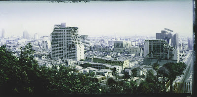
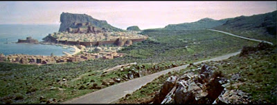
Vary your angles. Don’t shoot everything from the same viewpoint (unless this is a stylistic choice for impact). If you are filming a dog or a kid, get the camera down at their level. If you are filming a vast expanse of land, get the camera up high to get a vantage point.

(See my previous posting on “Where to Put the Camera” for a discussion on camera placement)

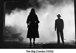
3: Lighting: A cinematic image looks lush and moody. To create this lush and moody look does not require a huge lighting set-up. Actually less is more. Filming a character lit by a single practical lamp while leaving the rest of the room in shadow instantly adds production value. Good lighting is less lighting. Shadows are your friends. Use lighting to direct attention to your main point of interest.

Use backlighting to create silhouettes.

Expose correctly. Leave some information in the shadows, avoid blown out highlights like the plague. And remember, the image you get in camera just needs to have an adequate range of exposure; you can do all sorts of tricks in grading to make your blacks really black or add tints and filters and make countless other adjustments.

4: Depth of Field: The depth of field defines the area of focus in your image. Being able to control what is or isn’t in focus has a huge impact on cinematic style and emotional connection to the subject matter/character.

A wide depth of field means that the vast majority of your image will be in focus. This is useful when trying to show a wide vista (a landscape or cityscape, for example) where you need to ensure that everything is in focus. F-stops of f.8 or more makes the camera lens’ iris smaller and ensures more of the image is in focus.

A shallow depth of field means that only a very selective area will be in focus while the rest of the image will be blurry. This is used to separate the foreground from the background for instance and is an essential tool when filming people during dialogue sequences so as to make sure that the viewer is focused on the actors and not distracted by something in the background. An F-stop of 5.6 or less allows this look.

The background takes on a blurry pattern that is called ‘Bokeh’. Different lens produce different types of Bokeh effects; some create more circular blobby patterns of light, while other’s make more hexagonal-style blobs.

Using a shallow depth of field is something craved for by independent low budget filmmakers for years in order to simulate the ‘cinematic look’. Before affordable digital SLR camera’s the shallow depth of field look was out of reach unless you were willing to splash out on a much more expensive camera.

But even if you only have access to a regular video camera you can still ‘cheat’ this shallow depth of field (or ‘blurry background’) look by zooming in as much as possible while positioning your camera further away from your subject. This makes the background more soft and is a way to get a less impressive, but still effective, shallow look.

5: Grading: No matter how well you light and expose your footage in production, when it comes time to assemble it all in the edit you will notice that, colour-wise, it wont look very impressive.

But don’t fret: this is where grading your images comes along to make everything look just like you imagined it should! Grading is basically adjusting the hue, saturation and contrast of your footage so that first it matches and then secondly it allows you to create a ‘look’ that defines your cinematic style.

A great way to practice grading is by opening a still picture in any basic image editor (IrfanView, for instance) and going to the menus and selecting ‘Image’, then scrolling down to ‘Enhance Colors’. This will give you options for adjusting brightness; the colour balance of the Red, Green and Blue channels separately; Contrast, Gamma Correction; and Saturation. A few subtle tweaks of the RGB values and the Contrast will have a massive impact on your image.

Increasing contrast, then increasing the Red and reducing the Blue values makes the image appear ‘warmer’.

Increasing the contrast, then reducing the Red value and increasing the Blue makes it ‘cooler.

Try it!

This is basically what you’d be doing in After Effects (or whatever editing/colour correction software you are using) in order to make your images come alive.

Stu Maschwitz’s book The DV Rebel’s Guide has a step-by-step process guide to colour correction that lays out in simple English how to go about turning an average looking shot into something truly cinematic.

Basically you need to firstly ensure that all your clips match. This means giving a general colour correction to your footage so that all the shots seem to be part of the same whole – and this is why it’s important to ensure when you are shooting footage that you get a good, clean exposure and not set out to complete a look in camera. The computer is where you should be fiddling with the look.

After making sure that all your clips match up well, you then move on to the creative stage: giving the footage ‘the look’. When you think of a Tony Scott movie you immediately think of over saturation and high contrast – this is his ‘look’. That’s just one example, go find yours.

When all these five elements are put together you are well on the way to getting the true cinematic look.

Of course none of this matters a bit if you have a crap script, awful sound and poor acting, but people judge things on first glance visually and ensuring that your film can compete in cinematic quality terms with the other films out there will prevent it looking amateurish and cheap.

These five points will instantly add production value to your work and without a huge deal of effort or stress. Ignoring them would be a futile waste considering how they require relatively little effort.


- Shane


(Images taken from Google.com/images. All images copyright of respective owners)

Thursday, October 13, 2011

Writing Films - How Descriptive should a Movie Script be?


Just how descriptive should a script be?


Well, it all depends on whether you are writing a script that you intend to make yourself or whether it is going to be made by somebody else.

I'm going to focus on talking about writing a script that you are making yourself.
I should warn you that this is another one of my long postings ;)


Ok. First things first: you should write in your own voice and manner. Don't go all flowery with the language just for the sake of it. If you are a straight-talking type person you should write in that way.

Remember, you are not writing a novel, you are simply trying to lay out the blueprint/set the tone for a movie.
You need to get the feeling of the story across and include references to any characters, locations, props you need...but no more.

The script is the blueprint.
It is not the be all and end all. It is an in-between stage to get your ideas from inside your head and present them in a clear and concise manner.

Let's take an example.
Say you have thought up a scene where a man walks into a bar and sits at a table.
It is a basic scene, but can be staged in countless ways.

You need to ask yourself the following questions:
- What is the purpose of the scene? How does it further the story?
- What is the character's motivation? Why is he here?
- Where are we? What does the location look like? What time of day does it take place?
- How can I get across the mood/feeling in a way that reflects the idea's in my head?
- How can I communicate this idea in a way that makes sense to the viewer?

The last point is the most important: the need to respect the audience and ensure that your idea's are conveyed in a way that they will accept and enjoy.

Let's move on to the process of getting it all down on paper.

One writer may keep it extremely basic and write:
1: "The man enters the bar. He walks across the floor and takes a seat at the far end. He orders a drink from the barmaid."

Another may write:
2: "It's late in the night, near closing time. A man in a tattered shirt and baseball cap pushes through the door, pausing briefly as a neon Budweiser sign hums and flickers behind him. He moves forward, head held low, through the almost empty place. Reaching the far end of the bar he draws back a wooden stool and sits down awkwardly. Raising a finger he orders a beer from a barmaid wiping down the counter top".

A third writer may put it like this:
3: "A wide interior establishing shot of a bar at night. Cut to a mid shot of man in cap pushing through the door. Pull-in as he pauses briefly in the doorway. We pull-in real tight for an extreme close up, revealing just his eyes and an out of focus Budweiser sign behind him. We cut to an overhead wide shot as he moves forward, head held low, through the almost empty place. Cut to a low-angle shot as the camera dollies behind him as he reaches the far end of the bar. Cut to a medium close up behind the bar as he draws back a wooden stool and sits down. Raising a finger he orders a beer. Cut to an over the shoulder shot of the man (with him filling most of the frame) as we see a barmaid wiping down the counter top".


Which one to use?
- The first one gets across the general idea but it lacks any emotion. It is flat. Boring. Dull.
- The second is descriptive and creates a mood that the first lacks.
- The third is descriptive and features camera placement ideas.


Despite number 3 having the inclusion of descriptions of camera moves and set-ups, I still believe number 2 is the best overall.


Having lots of intricate camera moves worked out in advance is fine when you know exactly the location you are going to be shooting in like the back of your hand. But you can get easily bogged down in simply recreating shots based on a plan rather than using your intuition and gut feeling which often leads to far superior outcomes.

I used to always over-write my scripts; every single camera movement described in precise detail.

But do you know what? It took the fun out of actually shooting stuff!

As far as I was concerned, the film was virtually already made on the page and the act of actually filming it was a tedious chore.

A script needs to include enough information to get across the feelings required yet still leave wiggle room when shooting.

You should be inspired by the script to go out and shoot.

Including certain essential camera moves/placements in ok, but you shouldn’t kill the story flow by breaking it up all the time with technical jargon that doesn’t enhance the story-telling.

Besides, you can use storyboards for this purpose if needed. And it’s far easier to have a quick glance at a picture than it is to make sense of a bunch of words trying to describe the angle and height of the placement of a camera!

A much more important element to include in a script is sound.

I’ve written before on the blog about the importance of sound in film, and it’s something that should be thought about at the script writing stage.

“An icy wind whistles through the alleyway, scattering a clanking tin can along the street” and “a throbbing beat resounds in Dave’s head, lub-dub-lub-dub, before he collapses to the ground with a mighty oomph” are just a couple of examples of how sounds play a vital role in bringing a script to life.

The name of a song/band/act a character is listening to in your story should be included instead of simply typing “John listened to a song”.

That tells us nothing! The line “John listened to Beethoven/Metallica/Tellytubbies” gives us an insight into the fascinating character of ‘John’!

Even if you don’t have the rights to use a particular song/artist you should still include it in the script. Who knows, you might get lucky and get permission to use that Beatles song you really wanted (Paul McCartney could be in a good mood that day). But even if you don’t, you can always use piece of royalty-free music that has a similar sound and will work just as well, if not better. Plus, because film is an audio/visual medium it should be planned to make use of the effectiveness of sound during the pre-production phase and not just concentrate on pictures.

An editor will always use a temporary soundtrack when piecing together a movie so as to find the correct rhythm of cuts; a scriptwriter should never ignore the power of music and sound either.

Including music references throughout your script will immediately add more life and character to your story.

This includes the use of sound effects where needed.

Let’s say your lead character is firing a gun during a getaway sequence: writing “John fired the handgun” is boring. But “John fired the handgun. Krackkkk!” lets the audience better visualise the feel of the weapon’s power.

Now lets get to wordiness. (yes I know I am one to talk!)

The average script breaks down as one page = one minute of screen time.

So a 90-minute movie would be roughly 90 pages long (when written in the standard Hollywood format).

You’re probably thinking that if you start adding all these descriptions of sounds and stuff like that you’ll end up with an un-doable 1000-page script!

This is where script editing comes into play.

Be selective in the amount of words you need to get your story across (says the man who has been busily typing all this!). You don’t need to describe every single detail of the rivets in the side of the ship in your Titanic-themed story. But if your story is about how some badly inserted rivets contributed to the sinking of the ship then you should be all means go all out and describe them in detail.

The whole thing is dependent on context: what you write is significant insofar as it moves the story forward and contributes to the tale.

A good script is like one of those little model buildings that architects have made-up when showing off a new development. It should be well made so as to convince viewers of the viability of a project and show a proposed depiction of what the finished job might look like. But it is an intermediary, a simulation of what the finished project might be like. It is not the finished goods - just like a script’s job is to be the solid foundation of a movie, something to inspire filmmakers on their journey to produce their best work.

Happy writing!


(all images from google images. Copyright of their respective owners)